Raster and SVG – The old and the new
In the first part of today´s blog I would like to talk a little about scalable vector graphics (SVG).
For the seasonable developer this is no new topic, however for those interested in tech matters, the post might give a couple of answers to your thoughts, so let´s get going!
Raster vs Scalable Vector Graphics (SVG)
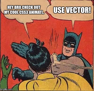
SVG graphics has been the dominant way of displaying vector graphics on the web for many years, it is mainly used for illustrations and CSS3 animations.
Most professionals use Vector nowadays because they offer scalability without image degradation. Before going further into SVG, let´s though take a little trip back in time to the beginning of the web.
The traditional way of displaying graphics since the start of the web was with Raster images also named bitmaps (Ex: JPG, PNG). When you look up on a photo on the web, it’s high chance it is a Raster.
Basically, with Raster, your image is rendered as a collection of tiny squares, called pixels.
Pixels, might seem invisible on the image at first, yet when you zoom in or scale up the image you will start noticing them taking the shape of tiny squares. The smaller the file size is, the faster they will appear.
Times have changed and the era of responsive web in which we are at the moment has made using Raster graphics more of a hassle, especially when it comes to maintaining the crispness of your design. Still, if you are going for this alternative, make sure to set a fixed height and dynamic width because this will make your Rater images more responsive (meaning will resize to fit the web view, for example, your web browser window).
When your container width is smaller, the image will scale down; on the other hand, when the image is bigger the container will automatically scale up. In the case of modern CSS frameworks, like for example Bootstrap, using it, you will also be offered this functionality easy and convenient via CSS classes.
A remaining problem is still to be considered: scaling a Raster will suffer something called “image degradation” and dynamical scaling will eventually make the image look even blurrier and less crispy. The reason behind this effect is the image´s new and modified size , now getting outside of the original one.
All disadvantages set aside, Raster continues to be common practice as a high percentage of web designers are using Photoshop to create website layouts and Raster images is how Photoshop rolls. Despite limiting you to using Raster, Photoshop helps you with editing your photos and makes it also fairly easy to do mockups, so no wonder many users continue to stick with it. Newer versions of Photoshop also gives you the ability to export CSS directly, which can help you in your workflow.
Besides, going into Vector programs like InkScape or Illustrator, usually requires a steep learning curve which many usually are unwilling to venture on (especially if they have been in a long term relationship with Photoshop).
If you are an adept of the more interactive alternatives, CSS3 animations are the thing for you. Yet, guess what? Raster might let you down in this scenario as well, making animations look blurry and “cheap”.
Thankfully, there is a salvation to this problem!
Tune in for the next chapter this Friday, when we go deeper into the modern way of displaying web graphics and you will find out all about the right way conquer all shortcomings using SVG instead.
Until then, feel free to comment!… And a happy week to you all!:)
